← All workOrder placed
Kaysaan: Filtered, not flooded.
- Client
- Kaysaan
- Sector
- E-commerce
- Scope
- Brand strategy · Identity · Packaging · Social
- Studio
- SiF8
Stage 01Order placed
Online shopping in Bangladesh asks the customer to carry the risk.
Fragmented f-commerce sellers. Counterfeit exposure. Deliveries nobody owns. The buyer is ambitious and image-conscious, and afraid of being embarrassed by what arrives.
The choice was a mass marketplace, a heritage artisan house, or a chaotic Facebook page. Nothing structured sat in the middle.
- Core tension
- “I want to look elevated without overpaying or risking embarrassment.”
- The gap
- No structured, brand-led, trust-first mid-premium brand in lifestyle essentials.
- Kaysaan enters as
- A structured, branded, mid-premium lifestyle brand with operational discipline.
Before: everything to everyone
- The trap
- When a brand tries to appeal to everyone, its message thins out until it appeals to no one.
- Market position
- Kaysaan was operating in a crowded, highly competitive market.
- The bottleneck
- It had operational scale and real ambition. What it lacked was a distinct voice, a look of its own, and a clear reason to be chosen over the established giants.
Stage 02Filtered
Everything passes through us first. Not everything passes.
Kaysaan is the disciplined curator for ambitious lifestyles. So before the logo, we wrote the filter: what the brand amplifies, what it deliberately avoids, and the one trade-off it accepts.
Run it yourself.
Send each one through the Kaysaan filter.
Passes: 0Stopped at the column: 0
We sacrifice extreme price competitiveness to protect perceived value.
The insight: move up to mid-premium
- Strategy first
- The goal was never a visual facelift. It was a change of market position, so that decisions get easier and growth gets more predictable.
- The pivot
- We moved Kaysaan from a mass-market commodity seller to a mid-premium lifestyle brand anchored in operational discipline. Narrowing the purpose and the message gave it a niche where it could lead instead of follow.
Stage 03Marked
An arrow that moves forward. A column that holds the line.
The forward arrow is disciplined progress: momentum without aggression, a buying journey that feels guided. The column is structure and restraint. It is the filter.
Together they form a restrained K. Not obvious. Discoverable.
The mark opens the name, so the logo and the symbol are never strangers.
What the strategy unlocked
- A contrarian palette
- Purple and yellow were chosen on purpose. Among the large e-commerce and f-commerce players, the combination is unexpected, so Kaysaan stands apart at a glance.
- Two identities, one system
- A strong wordmark is the foundation. A separate logomark works as the recognisable face of the brand, on screens and in the physical world.
- The moving-forward motif
- The logomark carries the brand’s forward-looking vision: momentum, product quality, and a smooth, dependable customer experience.
Stage 04Colour-coded
Purple, where everyone else is red or blue.
Ascend Purple separates Kaysaan from red-discount culture and blue-marketplace familiarity. Authority Gold is used sparingly. It highlights action, not price, and it must never dominate.
Ascend Purple
Primary. Ambition, distinction, upward movement.
Authority Gold
Accent. Value and optimism, in small doses.
Charcoal
Neutral dark. Grounded, structural.
Light Stone
Neutral. Hierarchy without noise.
Tap a colour to copy it.
Stage 05Labelled
Controlled, never loud. Confident, never desperate.
Jost keeps the platform organised and calm under pressure. Ragam brings a minimal serif to editorial moments, and Raleway steadies the promotions. Click any line and type your own.
Premium-calibre, at accessible pricing.
Where ambition meets composure.
Shown in EB Garamond on the web. Ragam is a licensed face.
Refined, simple language. Structured sentences.
Stage 06Packed
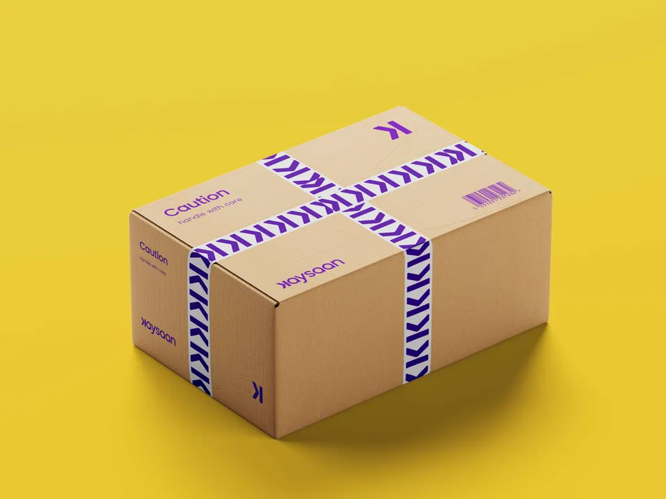
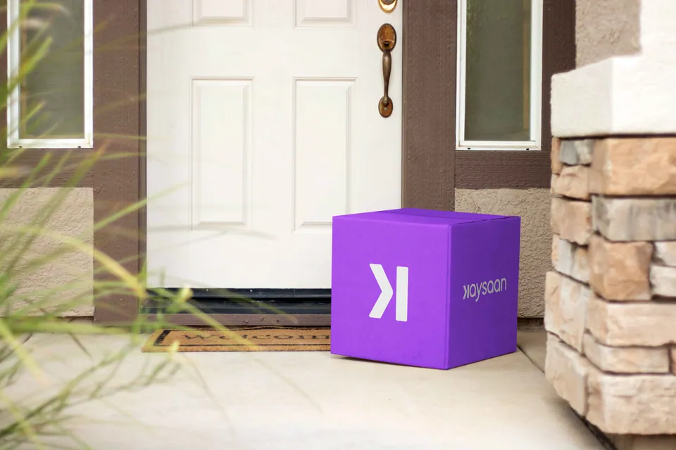
The box is the first thing the brand actually hands you.
Delivery boxes, seal tape and poly packaging carry the mark at the moment trust is tested: when the parcel is in the customer’s hands.

Strategy in the real world
- Why these touchpoints
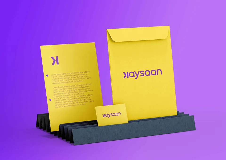
- An identity has to perform on real surfaces, not only on a mood board. We concentrated on the applications that carry the most weight.
- Where it was applied
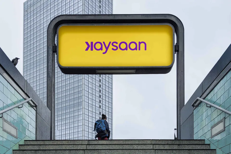
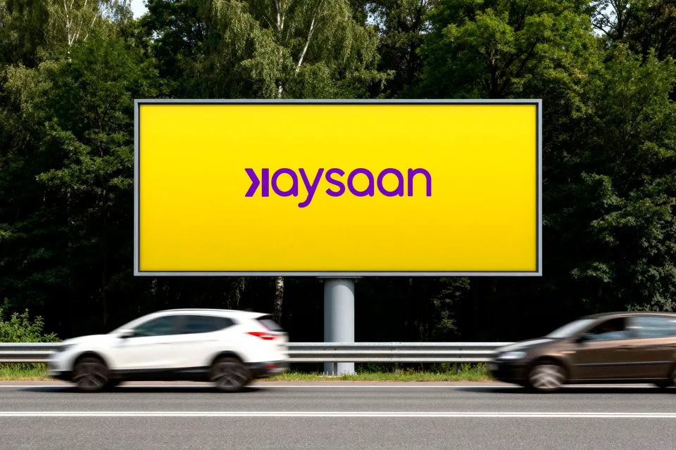
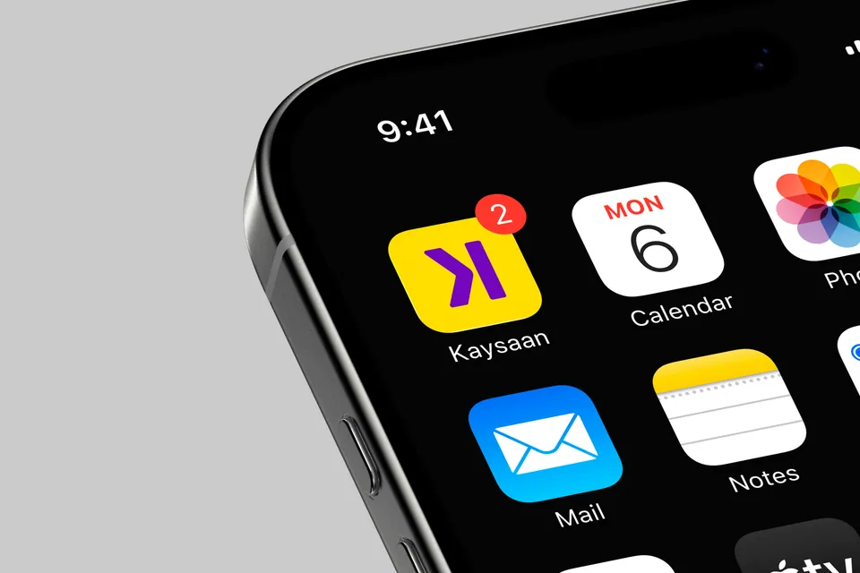
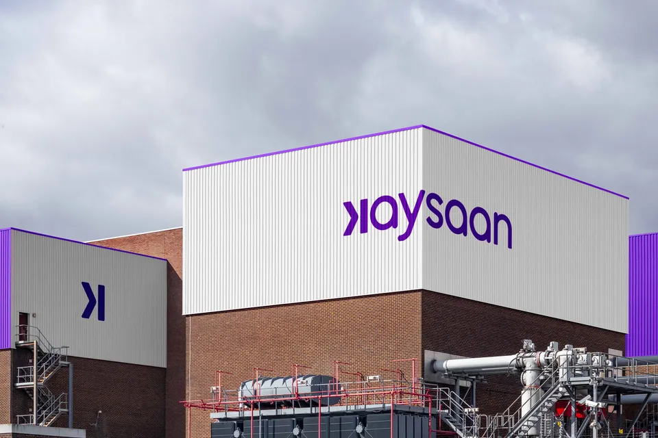
- Large-format outdoor billboards, delivery and packaging logistics, corporate branding, and the app icon.
Stage 07Out for delivery
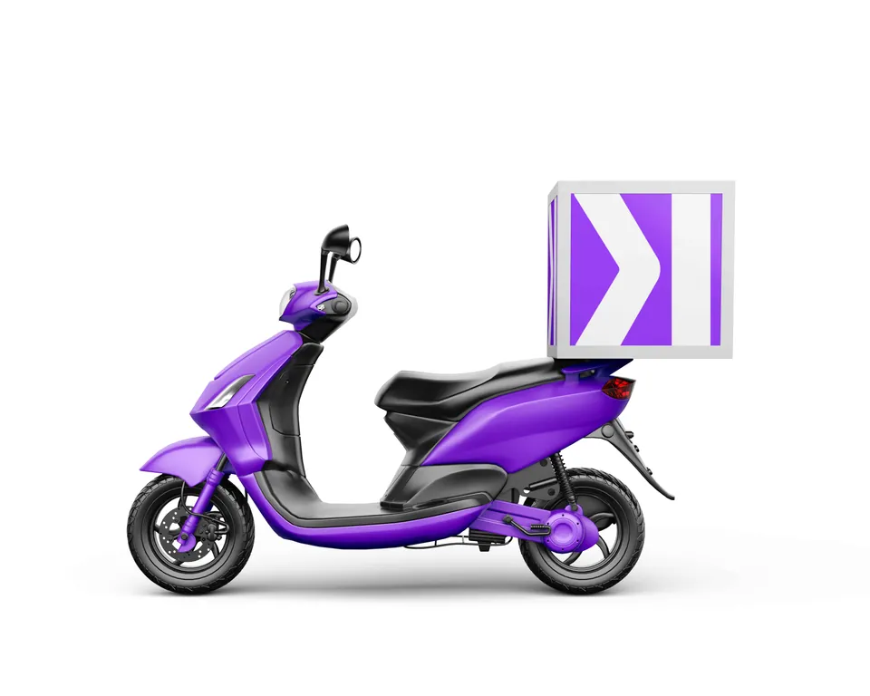
Then it leaves the warehouse.
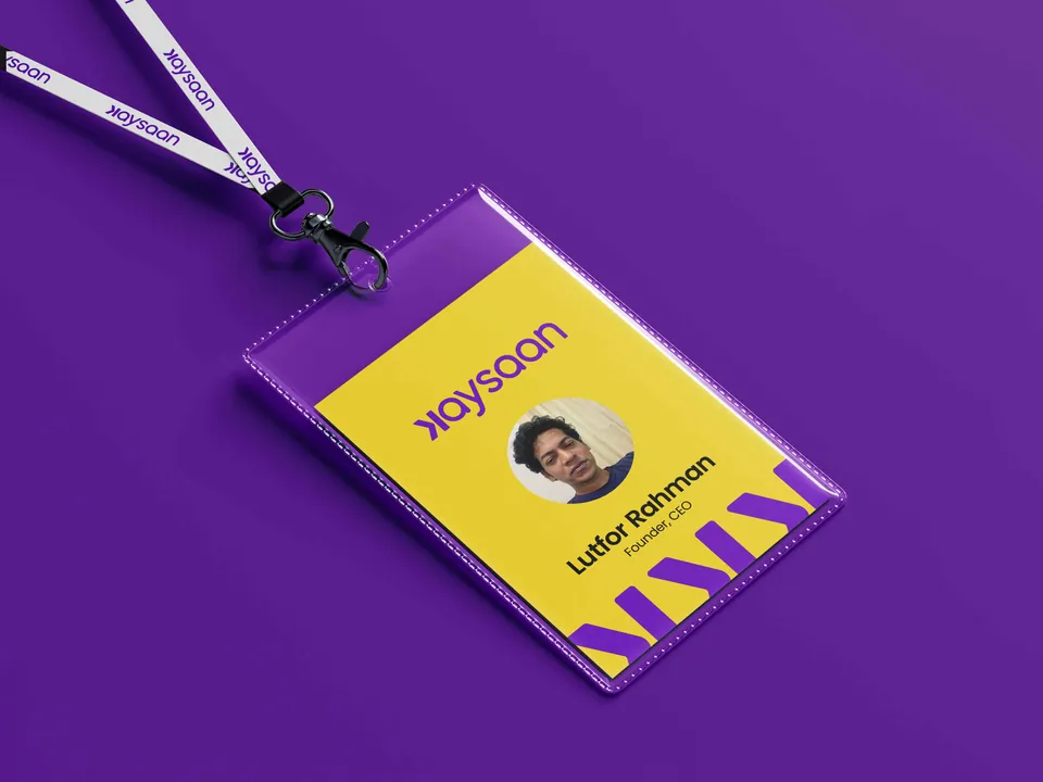
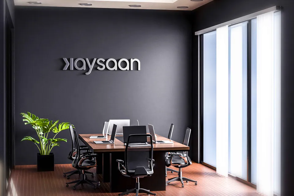
Riders, signage and the app icon. Each one puts the arrow in motion somewhere the customer already is.
Stage 08Delivered
A commodity seller went in. A mid-premium brand came out.
Kaysaan now has a sharpened voice, a visual language that stands apart from the marketplaces, and a clearly defined mid-premium audience to build for.
Stage 09The after state
What changed, across the whole business.
The repositioning was hard. In an oversaturated market the route to standing apart was not obvious at first. Careful research found the gap.
- Clarity of voice
- A sharp, targeted message replaced the diluted communication that came before.
- Visual distinction
- A visual language of its own, which holds up next to the industry’s biggest names.
- Market alignment
- A clear understanding of the mid-premium audience Kaysaan carved out, which makes business development and marketing easier to plan.
What this project taught us
- A niche can always be created
- There is usually an untapped segment waiting, as long as you are willing to focus the offer.
- Strategy lifts the ordinary
- With the right research and insight, even an everyday commodity can become a distinct and desirable lifestyle brand.
Every order, every time.
No manipulation. No excuses. Commerce handled the right way.