
← All workRead the label
Sustho+: If it cannot be backed by evidence, it should not be sold.
- Client
- Sustho+
- Sector
- Wellness
- Scope
- Brand strategy · Identity · Packaging · Social
- Studio
- SiF8
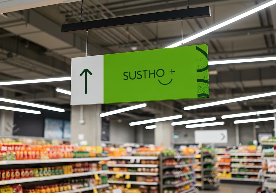
Section 01Diagnosis
The category has a trust problem, not a product problem.
Herbal sellers are fragmented. Adulteration is widespread. Religious claims stand in for evidence. People want natural solutions, and they are right to be afraid of being misled.
What the market does
- Emotional persuasion
- Cure language
- Long product lists
- Influencer testimonials
- Religious anchoring for authority
What Sustho+ does
- Ingredient transparency
- Evidence-backed communication
- Tight SKU discipline
- Preventive health education
- Clear limitation disclosure
The market diagnosis: a crisis of trust
- Market condition
- Natural supplements in Bangladesh are a fragmented and deeply mistrusted category: little scientific transparency, widespread adulteration, and brands that lean on religious claims or fear to drive impulse purchases.
- Customer reality
- Health-conscious professionals and family decision-makers want natural, preventive solutions. They also fear side effects, being misled, and “miracle” cures that turn out to be exaggerated.
Section 02Warnings
Some words are not allowed on this label.
The verbal identity is a guardrail system. Calm, but confrontational when necessary. Tap a word to see whether it would ever appear on a Sustho+ pack.
Would Sustho+ print this?
Printed: 0Never printed: 0
We sacrifice rapid impulse sales to protect long-term credibility.
The insight: the accountability layer
- Compete on integrity
- We concluded that Sustho+ could not win on product features alone. It had to win on integrity.
- The trade-off
- We positioned it as a science-grounded, purity-first challenger, and accepted a bold trade-off: give up fast, impulse-driven sales in order to build long-term credibility.
- Discipline as marketing
- If a formulation cannot be defended with evidence, it is not sold. That operating rule became the brand’s message.
Section 03Active ingredient
An O, a plus, and one curve. It winks.
At first glance: a friendly face. Look longer and the curve flows from the O to the plus. Whatever is needed to keep you well, and then something added.
Quieter still: a circle held by a protective curve. A mother and a child. NurtureFlow, care in motion.
The full typemark.
Design decisions
- The NurtureFlow logo
- The mark works on two levels. At a glance, the O, the plus and the soft curve make a friendly, winking face. Looked at longer, the circle and the protective curve suggest a mother nurturing a child: care, protection and complete well-being.
- A clinical-natural palette
- Sustho Green signals grounded vitality. Clinical White gives breathing space and readability. Botanica Noir adds structure. Active Yellow is reserved for scientific facts and actions, never for noise.
- Three typefaces, two scripts
- Jost for functional clarity, Anteroly for decisive headlines, and Hind Siliguri for Bangla, so health instructions stay legible for every reader.
- A behavioural sticker system
- The icon-led stickers are not decoration. Simple cues such as “Walk 20 Minutes” or “Hydrate. Nourish. Repeat.” sit on the packaging to prompt action and reinforce preventive health.
Section 04Composition
Four colours. Each one has a job.
Green for grounded vitality. White for transparency. Black for seriousness without looking pharmaceutical. Yellow is for facts and actions only, never urgency or discounts.
Sustho Green
Primary. Vitality, trust, balance.
Active Yellow
Accent. Facts and actions, never urgency.
Botanica Noir
Dark support. Structure and seriousness.
Clinical White
Core base. Breathing space around information.
Tap a colour to copy it.
Section 05Directions
Readable at dosage size, in two scripts.
Jost for clinical calm. Anteroly when the name must stand without the logo. Hind Siliguri so the Bangla instructions are as legible as the English. Click a line to edit it.
Prevention is more intelligent than repair.
অ আ ই ঈ উ ঊ ঋ এ ঐ ও ঔ
Your well-being, upgraded.
Shown in Jost on the web. Anteroly is a licensed face.
Section 06Daily use
Stickers that ask you to do something.
The sticker pack is a behavioural layer, not decoration. One clear message per surface, placed on inserts, boxes and thank-you cards. Drag them onto the parcel.
Drag a sticker. One clear message per surface.
Section 07On the shelf
Ingredients first. Graphics second.
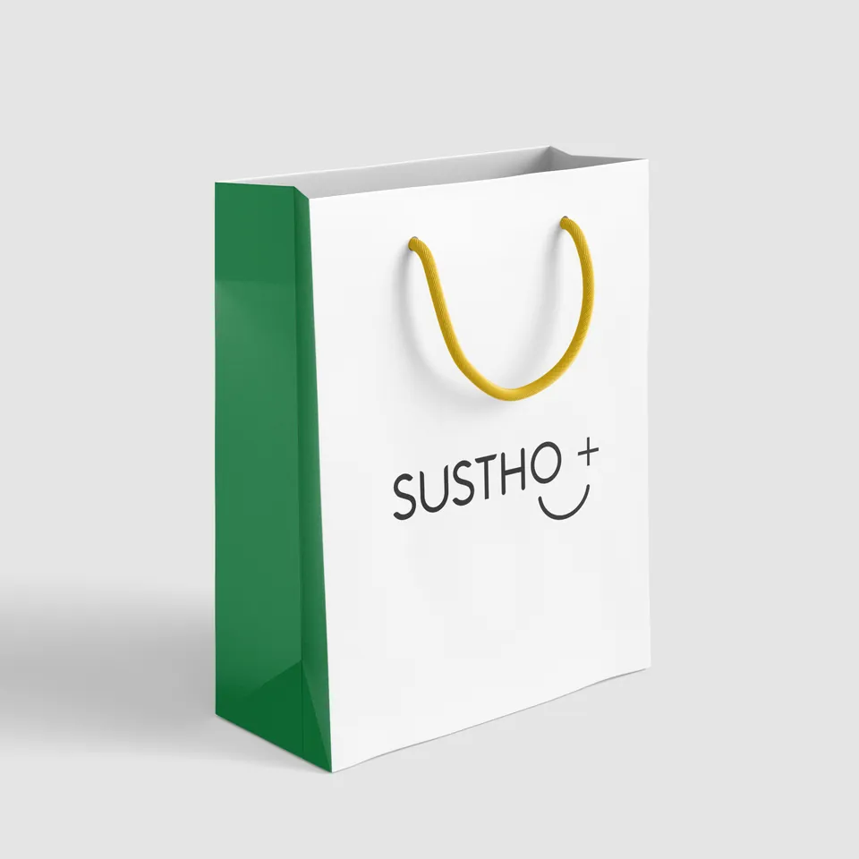
Pouches for Methi Mix and Arjun Mix put the formulation where a loud graphic would normally go. The showroom and stationery follow the same discipline.
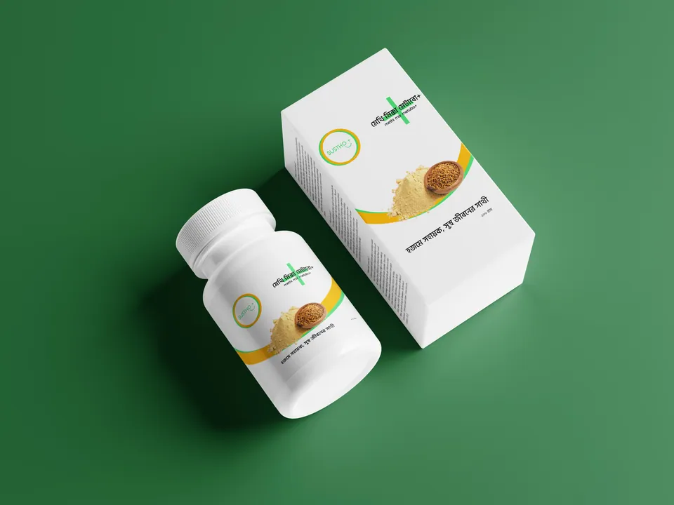
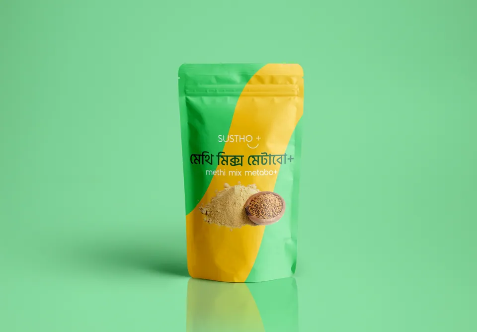
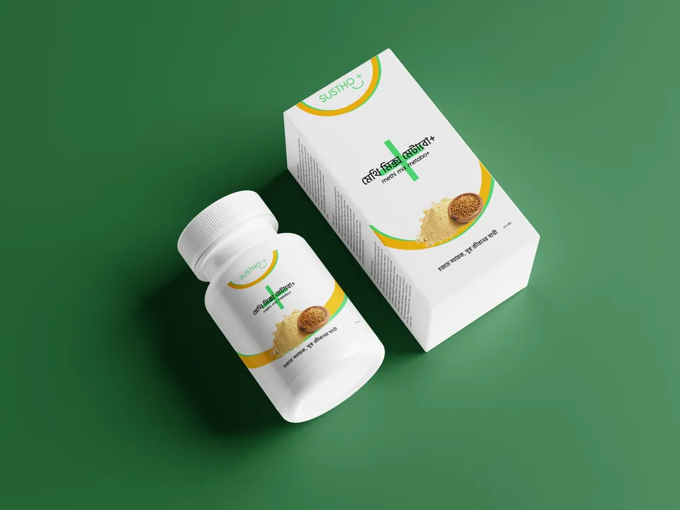



Strategy in application
- Formulation packaging
- Clean pouch designs for local products such as Methi Mix and Arjun Mix, which put ingredient transparency ahead of loud graphics.
- Retail and outdoor
- Billboards and well-lit showroom signage that project stability and institutional trust.
- Corporate identity
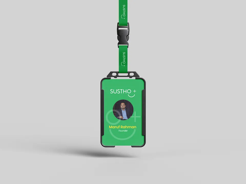
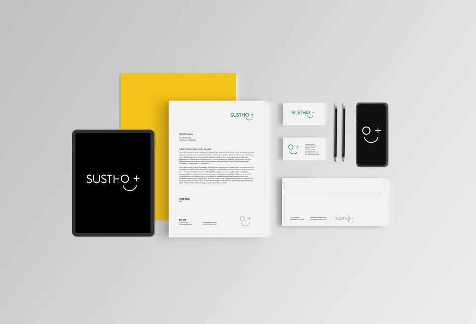
- Disciplined ID cards and stationery for the team, because the brand’s standard of care starts on the inside.
Section 08The outcome
A framework for credibility.
Sustho+ now has a visual language of its own and a clear verbal guardrail system: calm, but confrontational when it needs to be. It prefers phrases such as “clinically studied” and bans words such as “cure” and “miracle” outright.
In a market full of loud, exaggerated claims, radical transparency and disciplined design are what set a brand apart.
Prevention is more intelligent than repair.
No miracle claims. No fear-based selling. Every formula, every time.