
Wellness • Brand Strategy • Visual Identity
SusthoPlus
Positioning SusthoPlus as the Accountability Layer in Bangladesh’s Wellness Market
True brand building requires confronting market realities. For SusthoPlus, the challenge was not just launching a product, but fundamentally repairing consumer trust in a compromised category. Here is a look into our methodology for designing a science-first wellness challenger brand.
The Market Diagnosis
A Crisis of Trust
The natural supplement and herbal category in Bangladesh is highly fragmented and deeply mistrusted.
Market Condition
The space is dominated by low scientific transparency, widespread adulteration, and brands leveraging heavy religious claims or fear-based selling to drive impulse purchases.
Customer Reality
Health-conscious professionals and family decision-makers are caught in a core tension: they want natural, preventive health solutions, but they actively fear side effects, being misled, or falling for exaggerated “miracle” cures.

The Strategic Insight
The Accountability Layer
We determined that SusthoPlus could not simply compete on product features; it had to compete on integrity.
The Pivot
We positioned SusthoPlus as a science-grounded, purity-first wellness challenger. We anchored the brand around a bold strategic trade-off: deliberately sacrificing rapid, impulse-driven sales to build long-term credibility and trust equity.
The brand’s operational discipline became its marketing: if a formulation cannot be defended with evidence, it is not sold. SusthoPlus became the definitive accountability layer in natural wellness.
Actionable Design Decisions
What the strategy unlocked
Abstract principles of transparency and science had to translate into a visual and verbal identity that felt immediately credible to the Bangladeshi consumer.
The “Nurture Flow” Logo
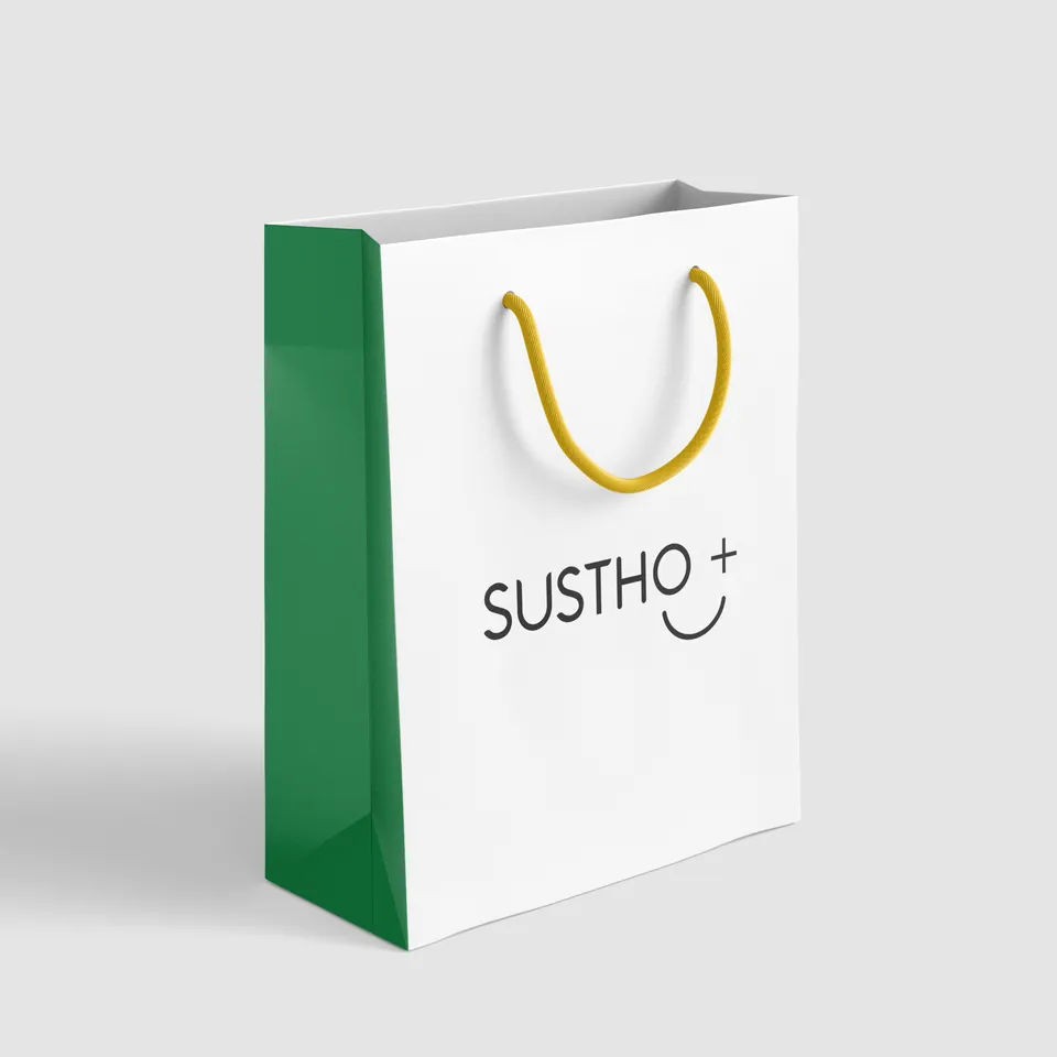
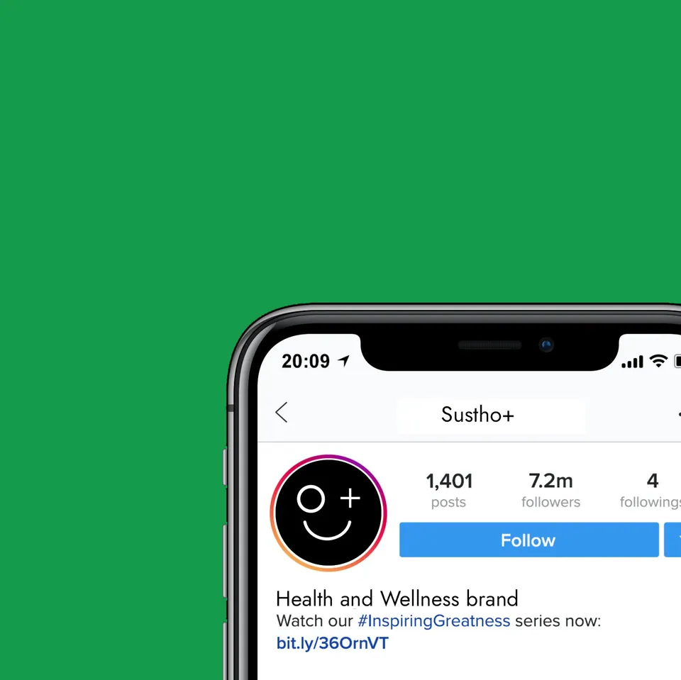
We designed a mark that operates on dual levels. At a glance, the “O”, the “+”, and the soft curve create an approachable, optimistic winking face. On a deeper, emotional level, the circular form and protective curve symbolize a mother nurturing a child — a quiet metaphor for care, protection, and complete well-being.
The Clinical-Natural Palette
To cut through the visual noise of artificial brightness in the market, we selected “Sustho Green” as the primary signal of grounded vitality. This is balanced by “Clinical White” to ensure breathing space and readability, “Botanica Noir” for structured seriousness, and “Active Yellow” used strictly for metabolic activation and highlighting scientific facts, never for “noise”.
Tri-Lingual Typography
To maintain clinical calm without losing cultural fluency, we deployed Jost for functional transparency and Anteroly for decisive, authoritative headlines. We paired these with Hind Siliguri for native Bangla communication, ensuring high legibility for health instructions across all demographics.
Behavioral Sticker System
We developed an icon-led sticker pack not as a decorative element, but as a behavioral reinforcement layer. Simple, high-contrast cues like “Walk 20 Minutes” or “Hydrate. Nourish. Repeat.” are placed on packaging to prompt action and reinforce the brand’s preventive health philosophy.
Hero Visuals · Strategy in Application
One system.
Every touchpoint.
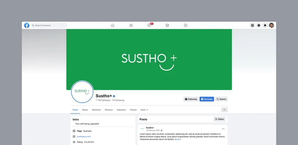
To prove the scalability of this rigorous identity, we executed the design system across high-trust touchpoints:
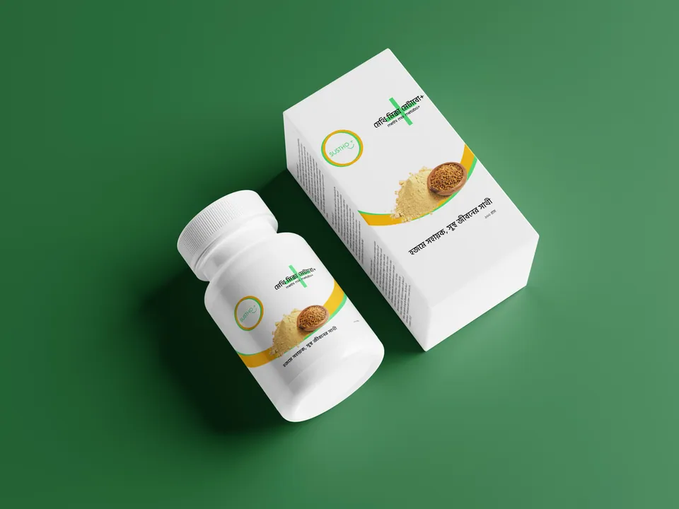
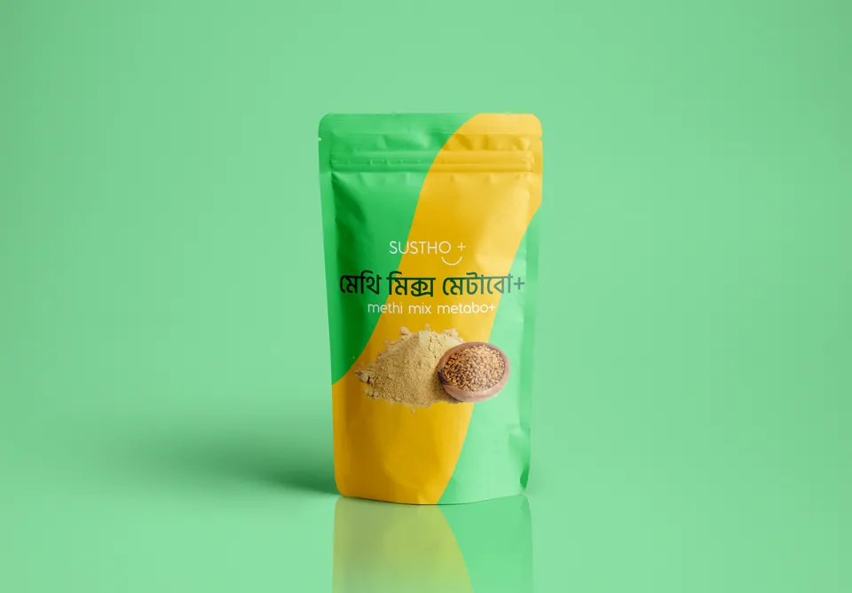
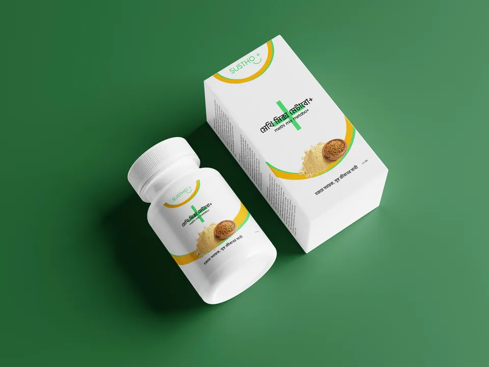
Formulation Packaging
Clean, pouch-based designs for localized products like Methi Mix and Arjun Mix that prioritize ingredient transparency over loud graphics.
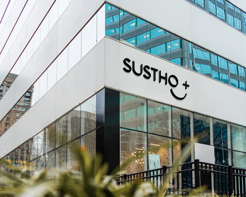
Retail & Environmental
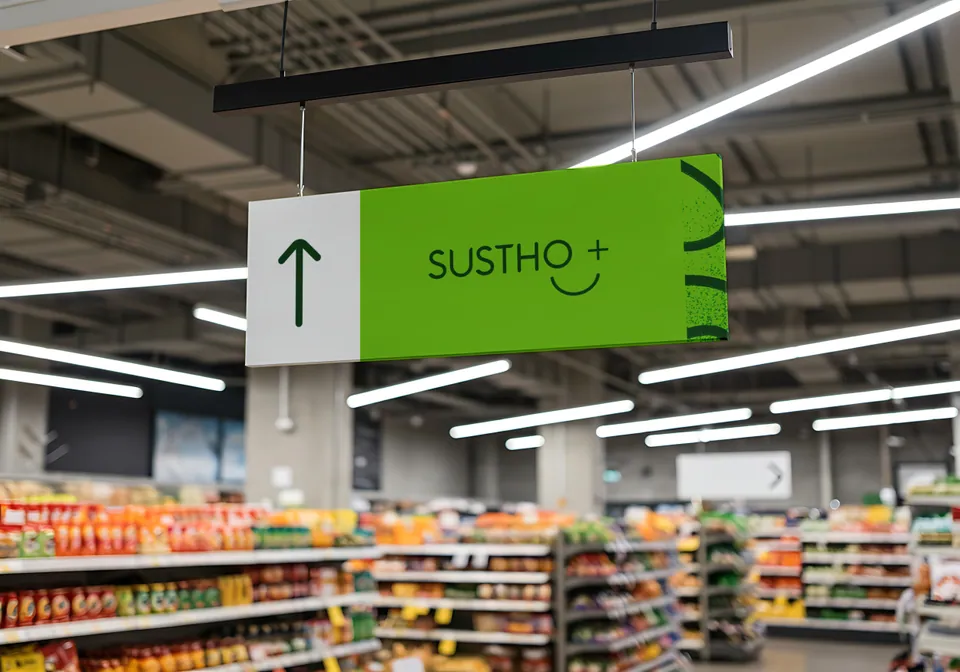
High-impact out-of-home (OOH) billboards and clinical, well-lit retail showroom signage that project stability and institutional trust.
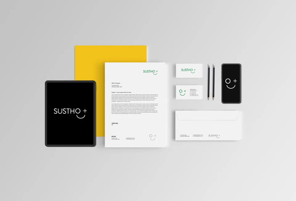
Corporate Identity
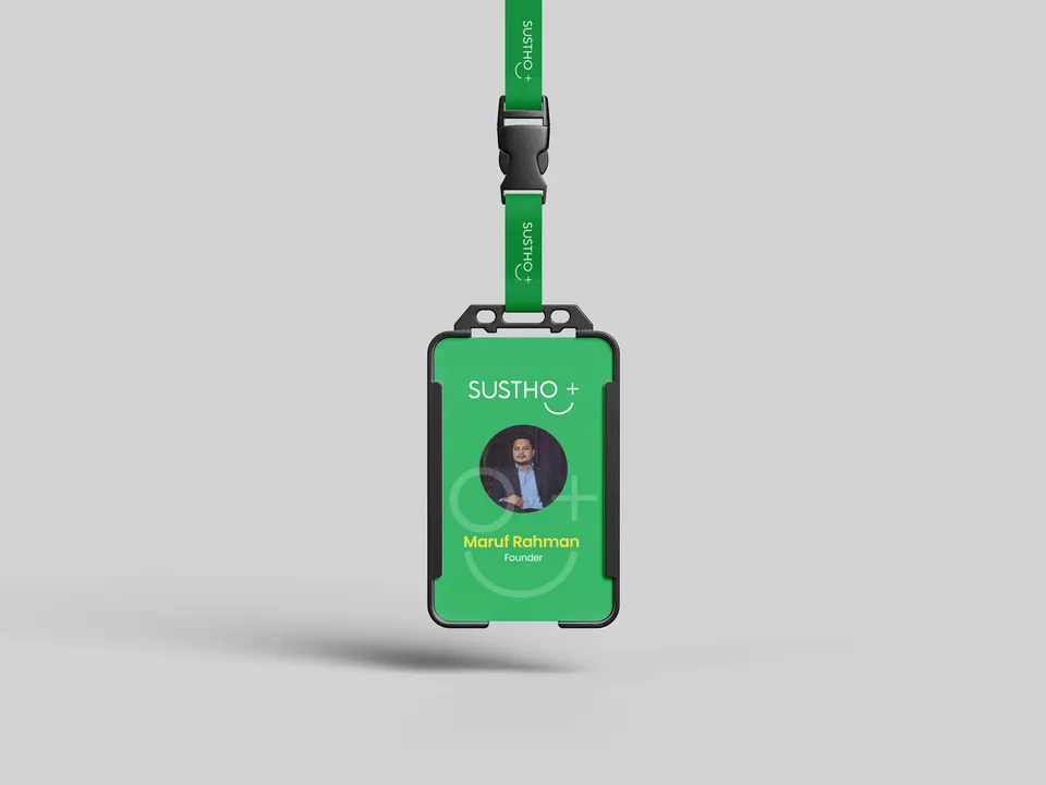
Disciplined ID cards and stationery for internal teams, reinforcing that the brand’s standard of care begins from within.
The Outcome
A Framework for Credibility
SusthoPlus was equipped with a distinct visual language and a clear verbal guardrail system: calm but confrontational when necessary, favoring terms like “clinically studied” and entirely banning words like “cure” or “miracle”.
This branding teaches a vital lesson in business development: in a market saturated with loud, exaggerated claims, radical transparency and disciplined design are the ultimate differentiators.
Want this kind of clarity for your brand?
Apply for the Basirah Brand Audit