
Wellness • Packaging • Visual Identity
Ahoron
Packaging Cultural Heritage for a Global Wellness Market
When a brand is deeply rooted in local culture and natural ingredients, it often falls into a predictable visual trap: it ends up looking like a rustic, neighborhood farmer’s market product. Here is our methodology for taking Ahoron — a premium, honey-based wellness brand — and engineering an identity that honors its Bengali heritage while commanding international, premium authority.
The Before State
The “Rustic vs. Premium” Dilemma
The natural wellness and honey sector is saturated with brands utilizing the exact same visual cues: generic honeycomb vectors, rustic brown paper textures, and overly traditional typography.
Market Position
Ahoron was positioned as a provider of premium honey-based products (spanning food, wellness, and personal care), aiming to reach a global audience seeking purity and vitality.
The Bottleneck
To compete globally, Ahoron needed to break away from the hyper-local, “homemade” aesthetic without losing its cultural soul. It required an identity that seamlessly united rich Bengali heritage with modern, premium innovation.
The Strategic Insight
“Modern Heritage”
We anchored the brand positioning around the concept of Modern Heritage.
The Pivot
Instead of relying on literal, expected illustrations of bees and honeycombs, we decided to embed the brand’s story directly into its cultural DNA — its language. We positioned Ahoron not just as a seller of honey, but as a lifestyle brand symbolizing diligence, trust, and the golden richness of nature.
Actionable Design Decisions
What the strategy unlocked
Abstract concepts of tradition and innovation were translated into a highly sophisticated, multi-layered visual identity.
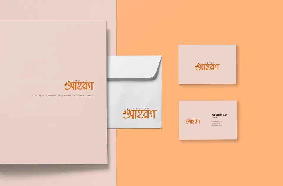
The Gestalt Brandmark (The Bengali “আ”)
We engineered a masterful typographic illusion. Using the classic Bangla letter “আ” (Aa) as the foundational architecture, we seamlessly embedded the silhouette of a bee and the subtle curve of a heart. It operates on three levels: cultural identity (the letter), industry relevance (the bee), and emotional connection (the heart).
The “Golden Vitality” Palette
We avoided dull, rustic browns. Instead, we established a vibrant, energy-driven primary Orange to symbolize trust, wellness, and the literal richness of honey. This is grounded by sophisticated Charcoal/Blacks and crisp White, giving the brand a clean, modern edge suitable for luxury retail.
The International Counterweight (Lato)
To balance the heavily cultural and ethnic primary logomark, we selected Lato (Light) for the English typography. Its clean, geometric sans-serif structure acts as a modern anchor, ensuring the brand remains legible and accessible to an international audience.
Hero Visuals · Strategy in Application
One system.
Every touchpoint.
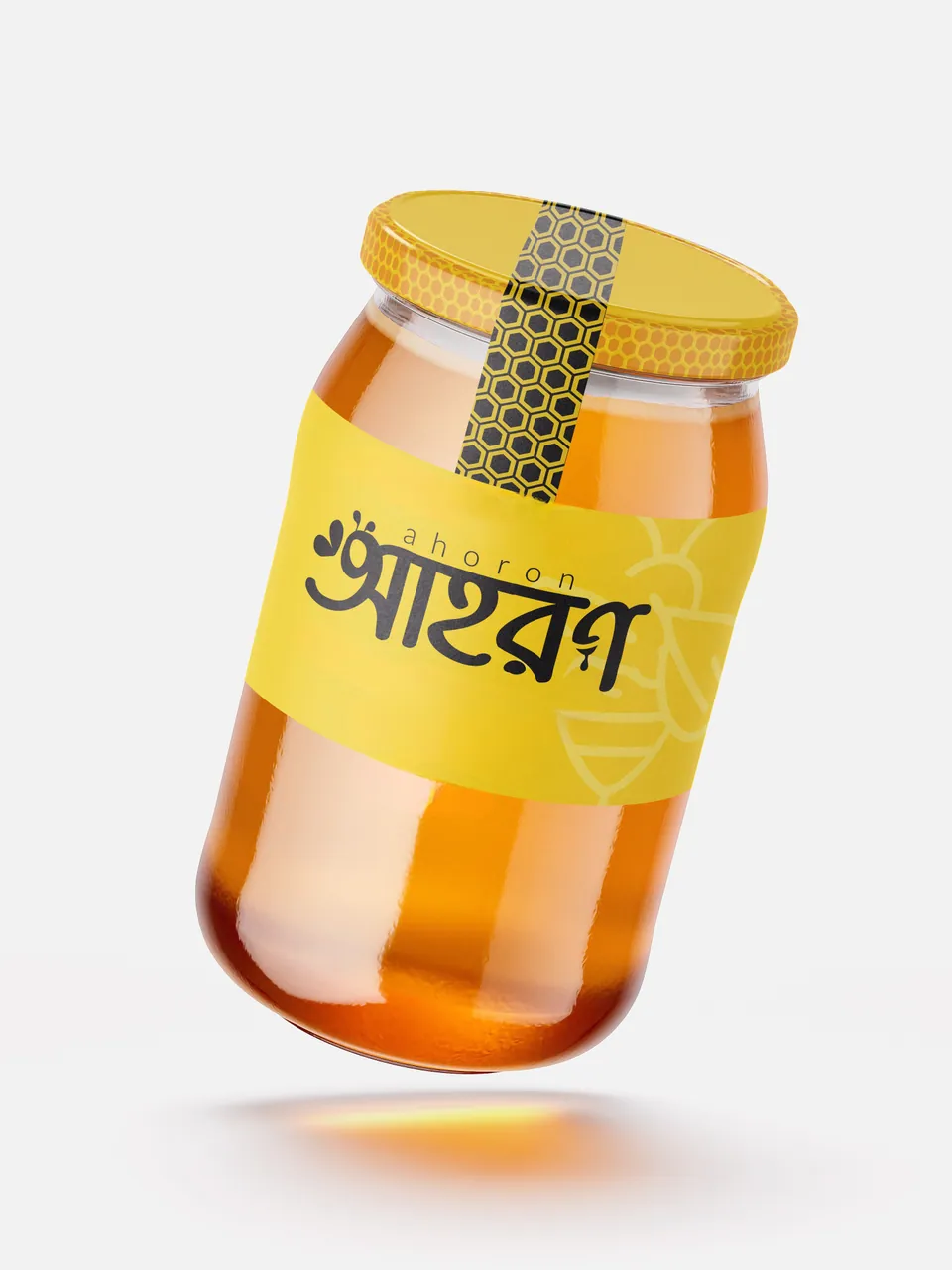
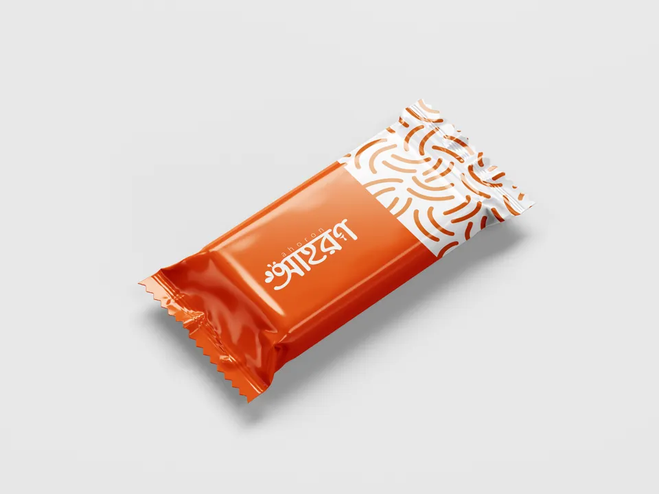
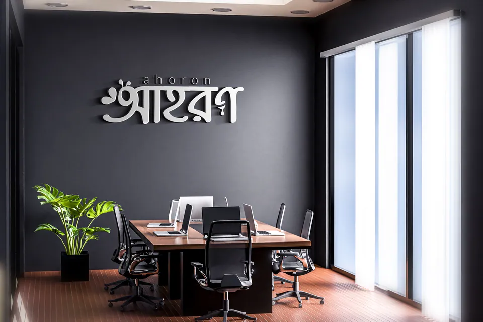
A true lifestyle brand must scale seamlessly from a small jar of honey to a physical architectural space. We stress-tested the Ahoron identity across diverse, high-value touchpoints:
Product Ecosystem Packaging
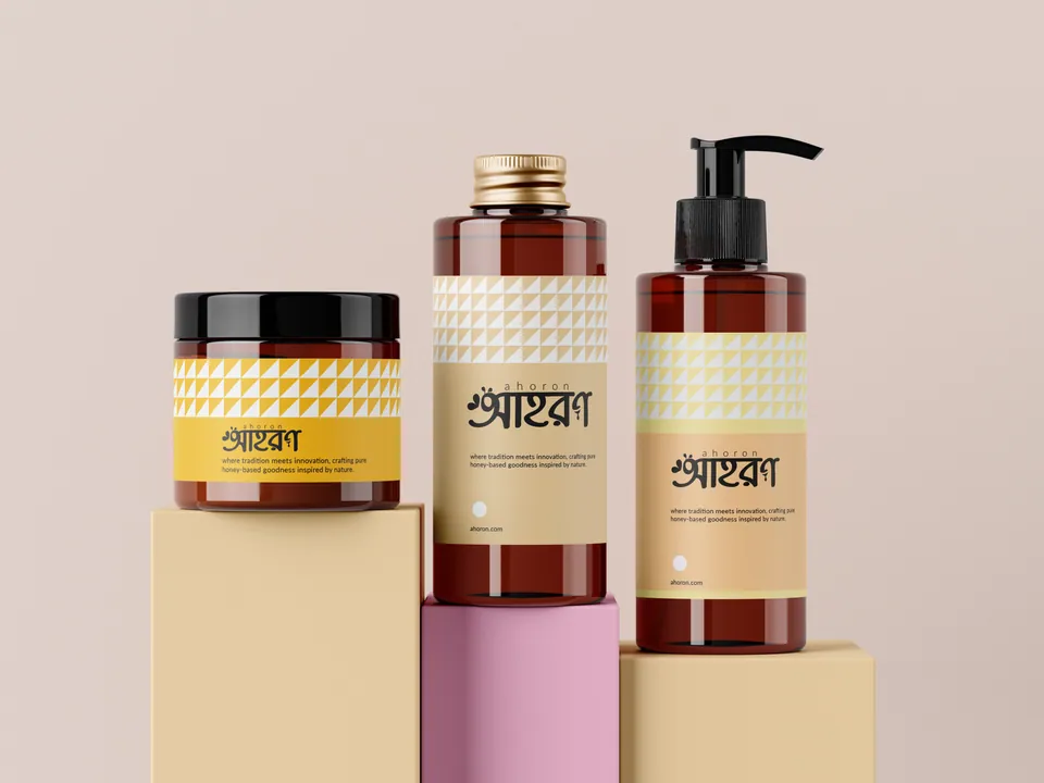
We designed a cohesive packaging system that unites diverse product lines — from raw honey jars to premium wax, shampoos, and energy bars — proving Ahoron is a comprehensive wellness lifestyle, not a single-product company.
The Heritage Shop Concept
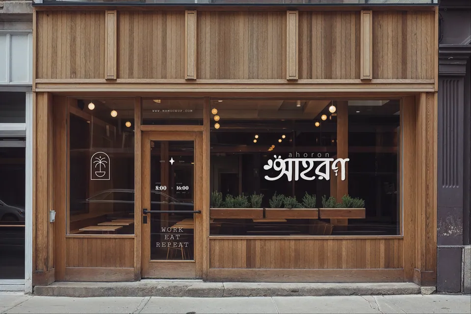
We visualized a physical brick-and-mortar cafe/retail space (“Work, Eat, Repeat”) utilizing warm woods and clean glass, demonstrating how the brand translates into premium, real-world hospitality.
Corporate Authority
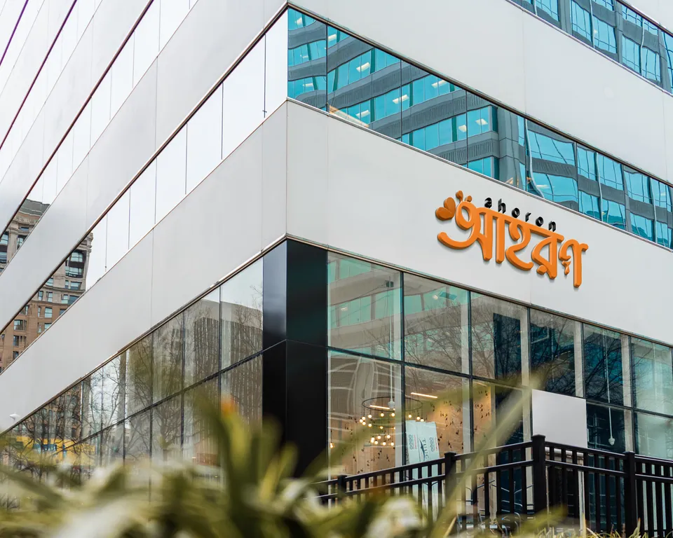
Large-scale, brushed-metal exterior signage on corporate buildings ensures the brand projects enterprise-level stability alongside its natural roots.
The Outcome
A Culturally Rooted Global Contender
Ahoron now possesses an identity that refuses to compromise between cultural pride and commercial scalability.
Instant Distinctiveness
By leveraging native typography as a modern design element, Ahoron instantly separates itself from Western-centric wellness brands.
Scalable Architecture
The clean, minimal execution ensures the logo retains its sanctity whether stamped on a tiny 64px digital favicon or illuminated on a corporate skyscraper.
Want this kind of clarity for your brand?
Apply for the Basirah Brand Audit