
E-Commerce • Brand Strategy • Visual Identity
Kaysaan
Transforming a Commodity Business into a Mid-Premium Lifestyle Brand
True brand building happens when high-level creative execution is rooted in deep, actionable strategy. A brand cannot simply be designed; it must be positioned. Here is a look into our methodology for taking a business from an undifferentiated commodity to a highly targeted lifestyle brand.
The Before State
The “Everything to Everyone” Trap
When a brand tries to appeal to everyone, its messaging becomes diluted and ultimately appeals to no one.
Market Position
Operating in an oversaturated, highly competitive, and crowded market.
The Bottleneck
Despite having operational scale and high ambition, the brand lacked a distinct voice, visual differentiation, and a clear reason for consumers to choose them over established giants.
The Strategic Insight
Elevating to Mid-Premium
Strategy must precede creativity. The goal was not just a visual facelift, but a fundamental shift in market positioning to make decision-making easier and growth more predictable.
The Pivot
We repositioned the business from a mass-market commodity to a mid-premium lifestyle brand anchored by operational discipline. By narrowing down their core purpose and messaging, we created a focused niche where they could lead rather than follow.
Actionable Design Decisions
What the strategy unlocked
Here is what the strategy unlocked. Abstract ambition was translated into actionable creative choices, ensuring every visual touchpoint served the new mid-premium positioning.
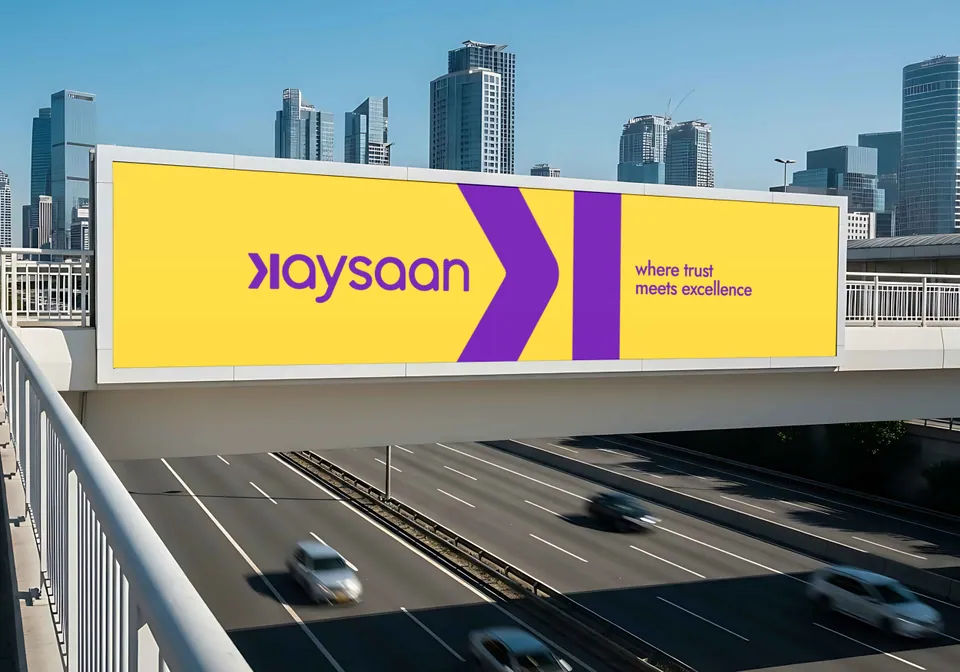
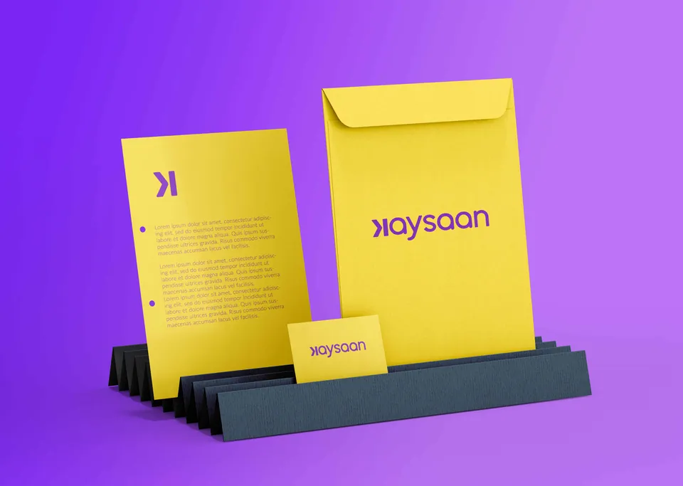
The Contrarian Palette (Purple & Yellow)
To instantly break away from the visual sea of large e-commerce and f-commerce competitors, we deliberately selected a striking, unexpected combination of purple and yellow. This created immediate visual disruption and market differentiation.
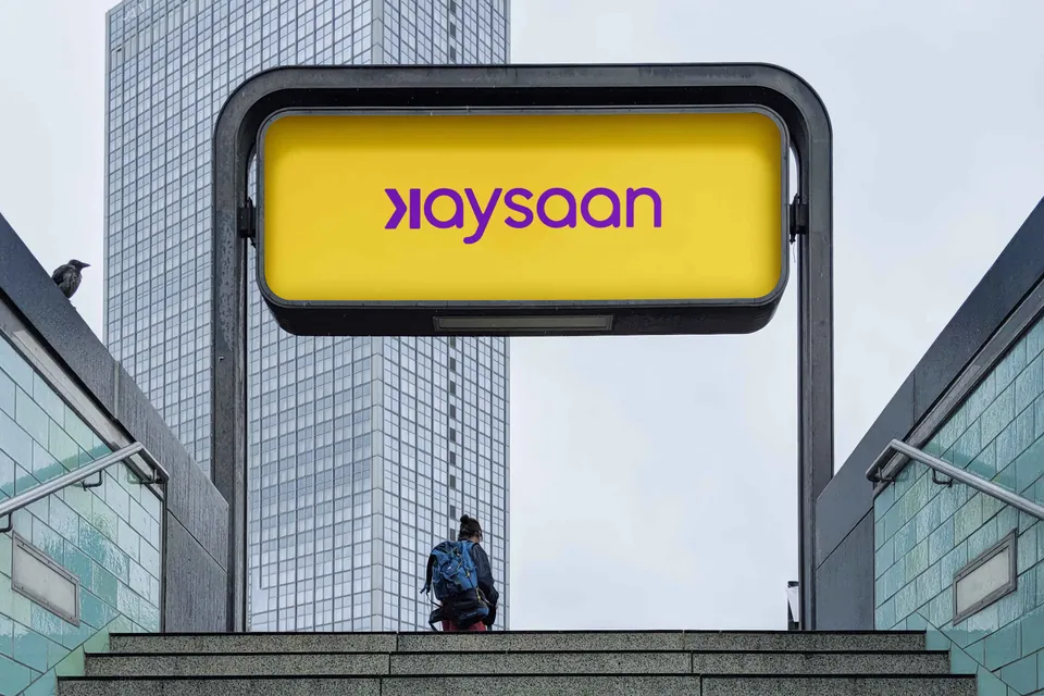
The Dual-Identity Architecture
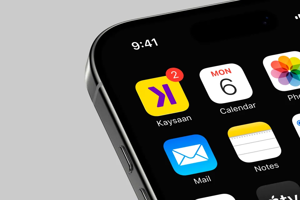
We developed a robust system utilizing a strong wordmark as the foundational logo, paired with a distinct logomark to serve as the recognizable “face” of the brand across digital and physical spaces.
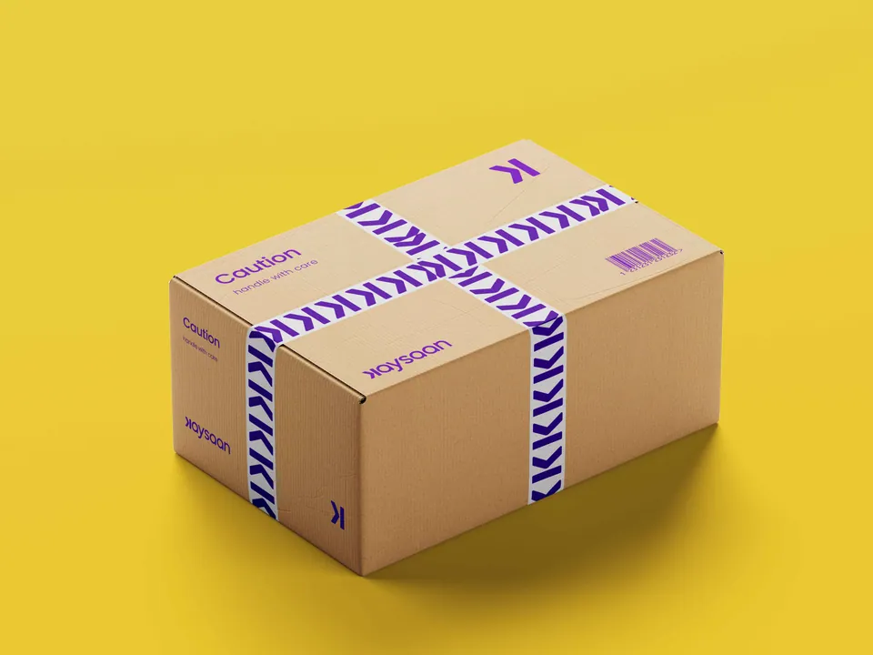
The “Moving Forward” Motif
The logomark was designed to encapsulate the brand’s forward-thinking vision. It signifies momentum, high-quality product innovation, and a smooth, steadfast customer experience. It acts as a visual guarantee of operational flow and ambition.
Hero Visuals · Strategy in the Real World
One system.
Every touchpoint.
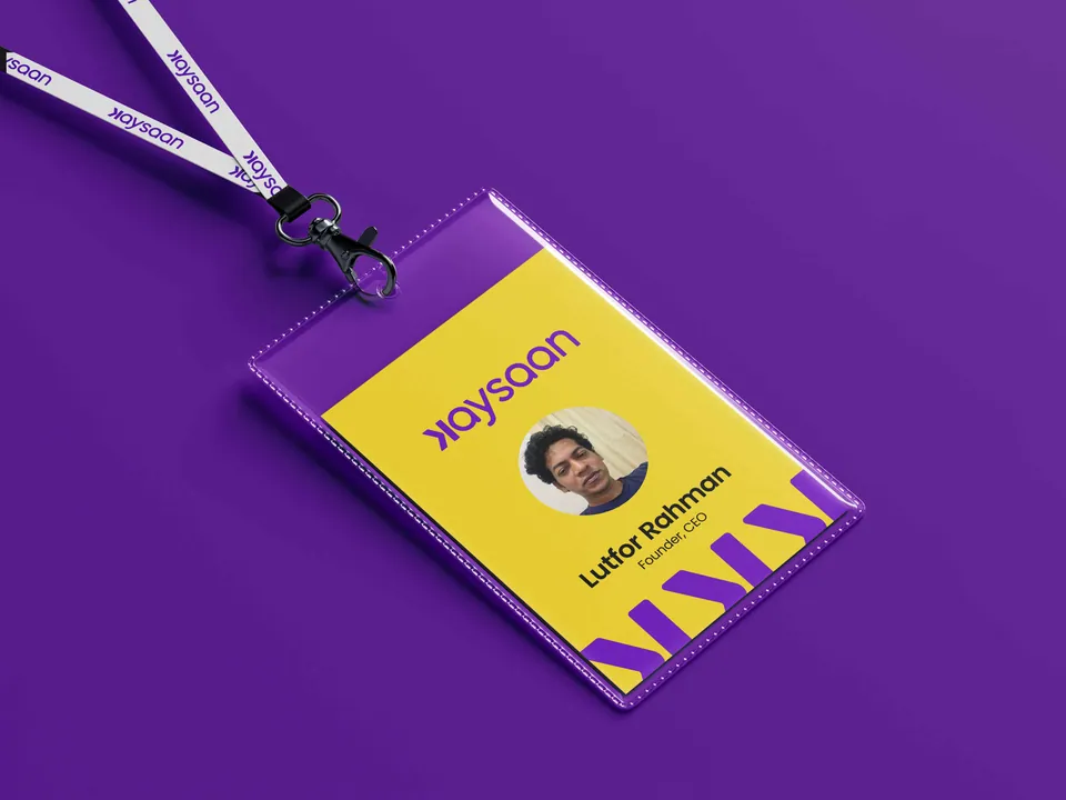
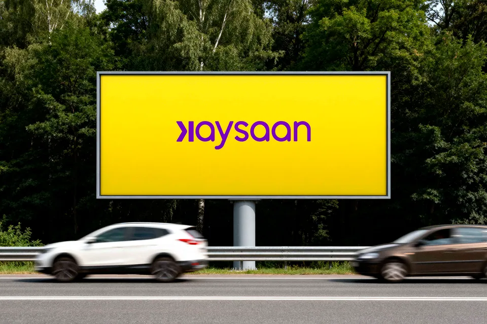
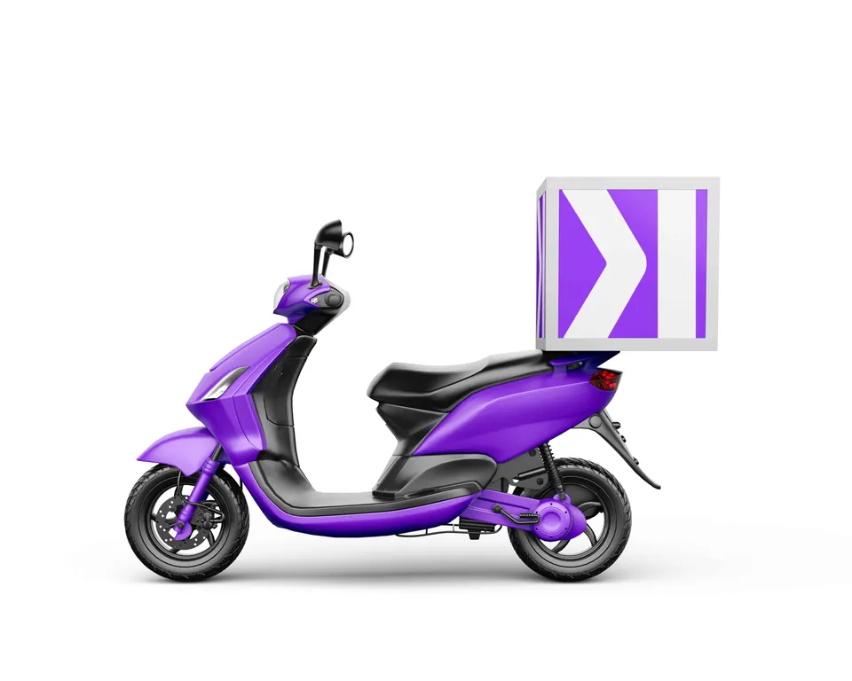
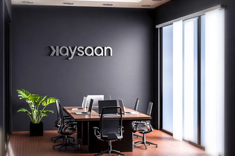
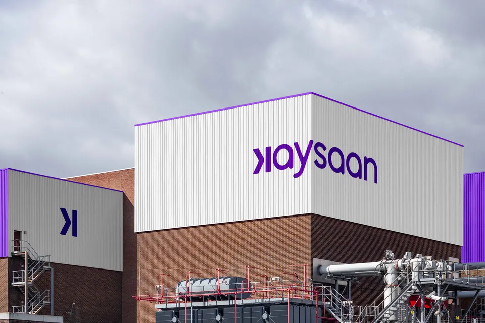
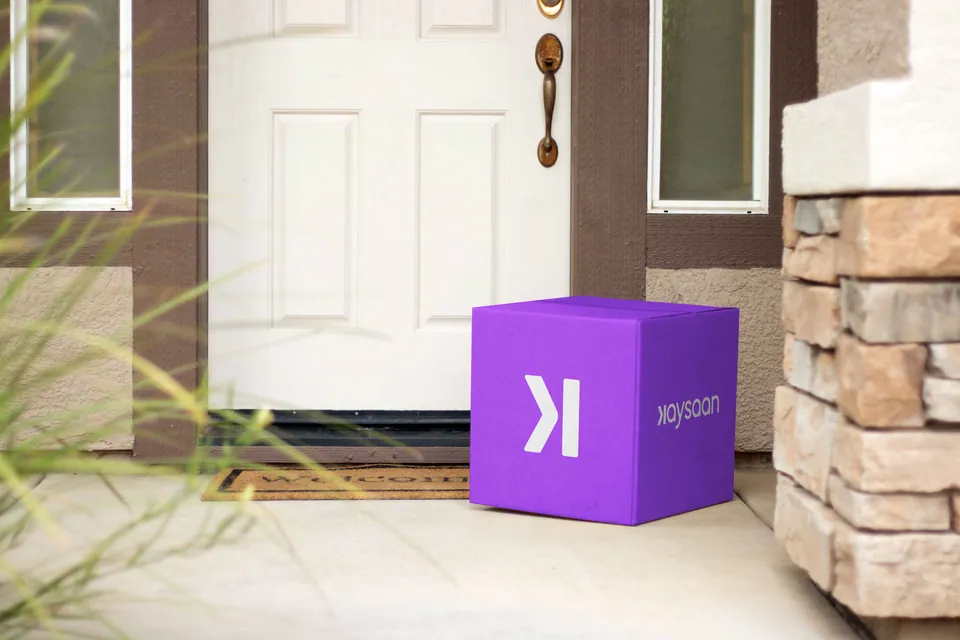
A brand identity must perform across real touchpoints, not just live on a mood board. To prove the scalability of this new mid-premium identity, we centered our visual execution on core, high-impact applications:
Large-scale Out-of-Home (OOH) Billboards
Premium Delivery and Packaging Logistics
Comprehensive Corporate Branding
Optimized Digital App Iconography

The After State
Quantifiable Brand Transformation
The transformation yielded a clear “after” state that resonated across their entire business model.
Clarity of Voice
A sharpened, highly targeted messaging strategy replaced the previous diluted communication.
Visual Distinction
A completely unique visual language that stands out against industry monopolies.
Market Alignment
A deep understanding of their newly carved-out mid-premium demographic, paving the way for targeted business development and scalable marketing.
Core Philosophy
The Power of Strategic Positioning
This repositioning was a monumental challenge. Entering an oversaturated market, the path to differentiation wasn’t immediately obvious — but rigorous research uncovered the gap.
This transformation reinforces two foundational truths of brand strategy:
- 1
Niches Can Always Be Created
There is always an untapped market segment waiting to be capitalized on, provided you are willing to focus your offering.
- 2
Strategy Elevates the Ordinary
With the right market research and deep strategic insight, even the most mundane commodity can be elevated into a distinct, highly desirable lifestyle identity.
Want this kind of clarity for your brand?
Apply for the Basirah Brand Audit