← All workConnecting
Alpha Broadway System: Infrastructure, not just internet.
- Client
- Alpha Broadway System
- Sector
- Broadband & tech infrastructure
- Scope
- Rebrand · Identity
- Studio
- SiF8

Link 01No signal
A city-wide network, dressed as a neighbourhood vendor.
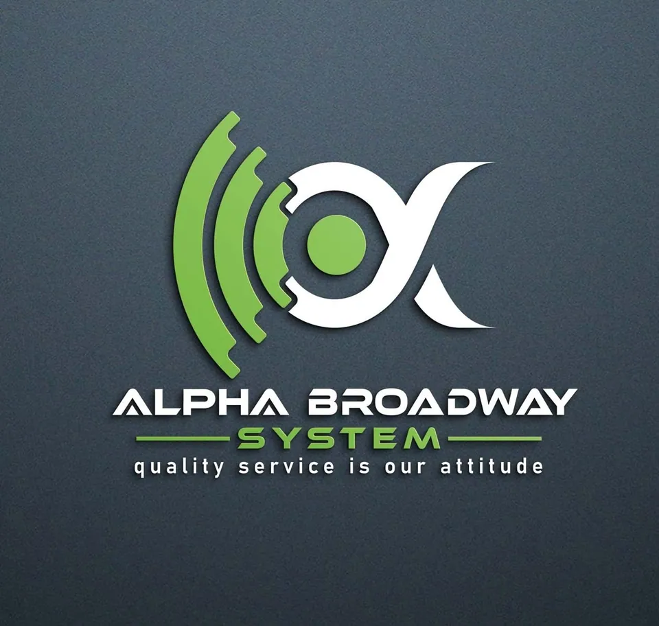
When we first audited Alpha Broadway System, its capabilities and its identity did not match. The network had grown across all of Dhaka. The brand still looked like a local service.
That look was a ceiling. It kept the company from being taken seriously by the customers it most wanted: premium residential buildings and luxury apartment developers.
Before: the local vendor ceiling
- The wrong colour
- Bright green was the primary brand colour. It confused people, because a broadband company has no eco-friendly or sustainability message to carry.
- The wrong scale
- The logo and visual language said “local neighbourhood service”, even though the infrastructure had scaled across the whole city.
- The cost
- Because the identity had not matured with the network, the message was diluted and the premium market stayed out of reach.
Link 02Reroute
You cannot win premium contracts in a vendor’s uniform.
Scaling a brand means scaling its identity. The strategic move was to reposition Alpha Broadway as a modern, reliable tech infrastructure company.
That meant removing the confusing green and building an identity around one feeling: continuous, uninterrupted data flow. The brand had to look as fast, reliable and premium as the buildings it wanted to serve.
What the old identity said
- Neighbourhood service
- Green, with nothing green to say
- A local startup
What the new one says
- Tech infrastructure
- Tech Blue: trust and speed
- A Dhaka-wide provider
Link 03Plugged in
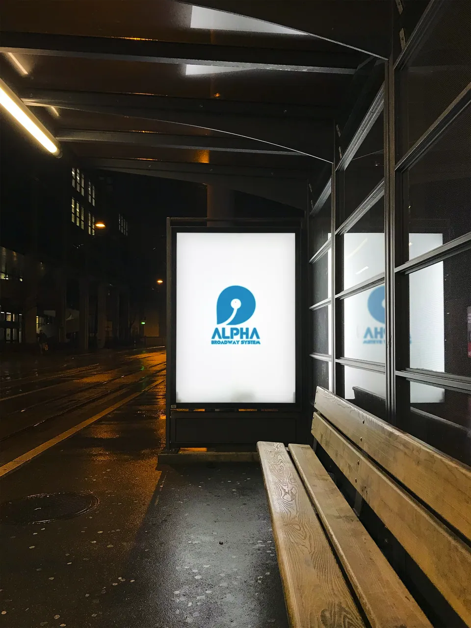
A lowercase a, with an Ethernet cable running through it.
We skipped abstract ideas and built a literal one. The round-ended cable sits in the negative space of the letter, so “broadband” becomes something physical: a connection you can see.
- Lowercase a
- Ethernet cable
The Ethernet brandmark
Design decisions
- The Ethernet brandmark
- A lowercase a combined with the minimal, circle-edged outline of an Ethernet cable. It turns the abstract idea of broadband into a tangible symbol of physical connectivity.
- The psychology of flow
- The circular elements and the sweeping curve inside the letter suggest continuous, uninterrupted data. For people who expect flawless streaming and smart-home connectivity, it promises stability and zero friction.
- The palette correction
- The legacy green is gone. An authoritative Tech Blue leads, supported by deep midnight blacks and purples. The brand now reads as trustworthy, fast and premium.
Link 04Uptime
Proof of scale, for the people who manage buildings.
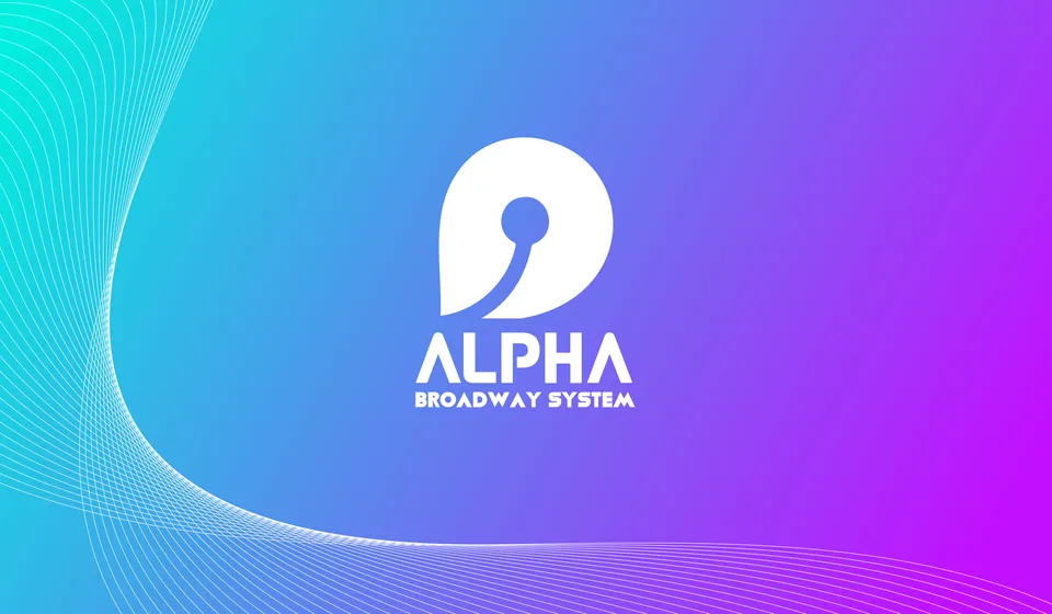
To show its city-wide authority to residential building managers, the applications focus on scale and professionalism.
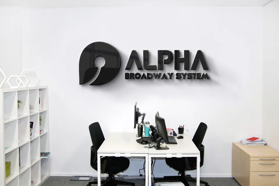
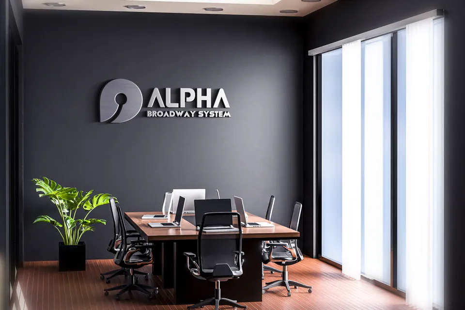
Strategy in application
- Fleet and technicians
- The logo on installation vans, uniforms and ID badges tells building security and management that this is a professional, enterprise-level operation.
- Digital interfaces
- Clean, dark-mode web and app dashboards that show network speed and data usage, which supports the modern tech company position.
Link 05Connected
It now looks like the provider it already was.
Alpha Broadway System has left its neighbourhood-startup look behind. Its visual cues now match what it actually delivers, so it can pass low-tier competition and earn trust in the premium residential sector.
Wrong positioning equals a confused consumer.
- Positioning dictates perception
- If your visual identity contradicts your operational reality, your market will keep underestimating you.
- The fastest fix
- Correcting the visual language is the quickest, most effective way to correct how the market sees you, and to claim the customers you are ready for.
Connected.
Infrastructure, not just internet.