

Broadband & Tech Infrastructure • Rebrand • Visual Identity
Alpha Broadway System
Wrong Positioning, Wrong Guideline = Confused Consumer
True infrastructure companies cannot scale with the visual identity of a neighborhood vendor. For Alpha Broadway System, the challenge was not network capability — it was market perception.
Here is our methodology for transforming a broadband provider into a premium tech infrastructure brand built for Dhaka’s modern residential ecosystem.
The Before State
The “Local Vendor” Ceiling
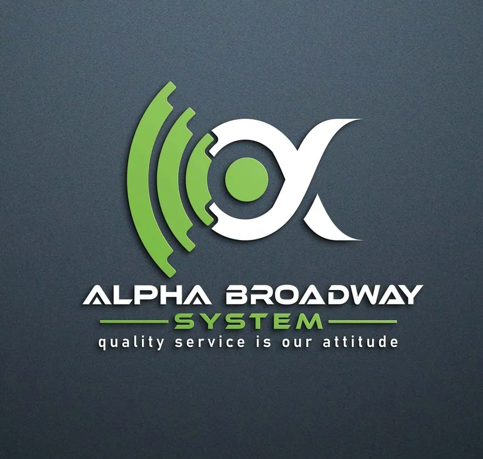
When we first audited Alpha Broadway System, there was a massive disconnect between their operational capabilities and their visual identity. They were using bright green as their primary brand color — a choice that confused consumers, as a broadband company inherently has no eco-friendly or sustainability-driven core messaging.
More critically, their logo and overall visual language were screaming “local neighborhood service,” even though the business had successfully scaled its infrastructure across all of Dhaka. Because their visual identity hadn’t matured alongside their network, their messaging was diluted.
This “local vendor” aesthetic was actively creating a glass ceiling, preventing them from being taken seriously by their most lucrative target demographic: premium residential buildings and luxury apartment developers.
The Strategic Insight
Infrastructure, Not Just Internet
Brand scaling requires identity scaling. You cannot secure high-margin contracts in premium residential complexes while wearing the uniform of a neighborhood vendor.
The Pivot
The strategic pivot was to reposition Alpha Broadway as a modern, reliable tech infrastructure company.
We needed to strip away the confusing “green” associations and build an identity rooted in the psychological feeling of continuous, uninterrupted data flow.
The goal was to make them look as fast, reliable, and premium as the high-end residential buildings they wanted to service.
Actionable Design Decisions
What the strategy unlocked
To execute this, we bypassed abstract ideas and developed a highly intentional, literal visual architecture:
The “Ethernet” Brandmark
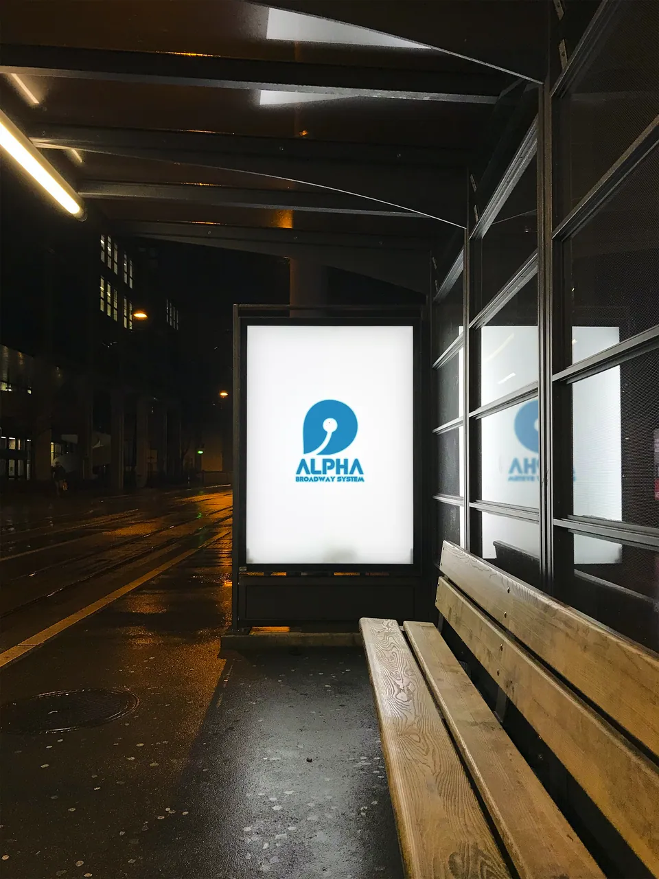
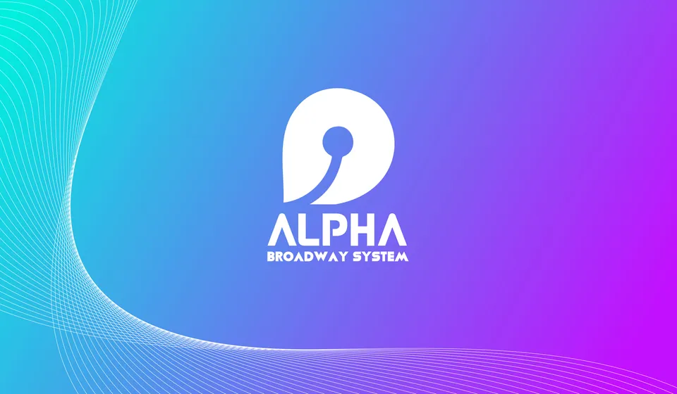
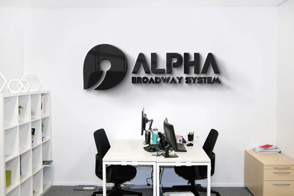
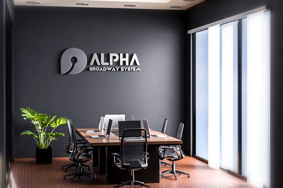
We engineered a lowercase ‘a’ combined with the minimal, circle-edged imagery of an Ethernet cable. This grounds the abstract concept of “broadband” into a tangible symbol of physical connectivity and premium tech infrastructure.
The Psychology of Flow
The circular design elements and the curved, sweeping negative space inside the ‘a’ reflect the continuous, uninterrupted flow of data. It visually promises effortlessness, stability, and zero friction for high-end users who demand flawless streaming and smart-home connectivity.
The Palette Correction
We completely eliminated the legacy green. In its place, we introduced an authoritative “Tech Blue” primary palette, supported by deep midnight blacks and purples. This instantly realigned the brand’s psychology with enterprise-level standards for trust, high-speed technology, and premium service.
Hero Visuals · Proving Scale and Reliability
One system.
Every touchpoint.
To prove the brand’s new city-wide authority to residential building managers, the visual applications focused heavily on scale and professionalism:
Fleet & Technician Branding
Showcasing the sleek new logo on installation vans, technician uniforms, and ID badges — proving to premium building security and management that Alpha Broadway is a highly professional, enterprise-level operation.
Digital Interfaces
Clean, dark-mode web UI and mobile app dashboards showing network speed and data usage, reinforcing the “modern tech company” positioning.
The Outcome
Claiming the Premium Market
Alpha Broadway System finally shed its “neighborhood startup” baggage.
By aligning their visual cues with their actual service offerings, they now possess a cohesive, authoritative visual language. They look like the major, Dhaka-wide broadband player they are, allowing them to bypass low-tier competition and confidently command trust and secure contracts within the premium residential building sector.
Core Philosophy
Positioning Dictates Perception
This transformation teaches us a vital lesson in brand strategy:
- 1
Wrong positioning equals a confused consumer.
If your visual identity contradicts your operational reality, your market will always underestimate you.
Correcting the visual language is the fastest, most effective way to correct market perception, elevate your target demographic, and claim your rightful market share.
Want this kind of clarity for your brand?
Apply for the Basirah Brand Audit