← All workFrom the hive
Ahoron: Heritage you can taste. A letter you can read.
- Client
- Ahoron
- Sector
- Honey & wellness
- Scope
- Brand guidelines · Identity · Packaging
- Studio
- SiF8
Cell 01The hive
Honey, and everything made from it.
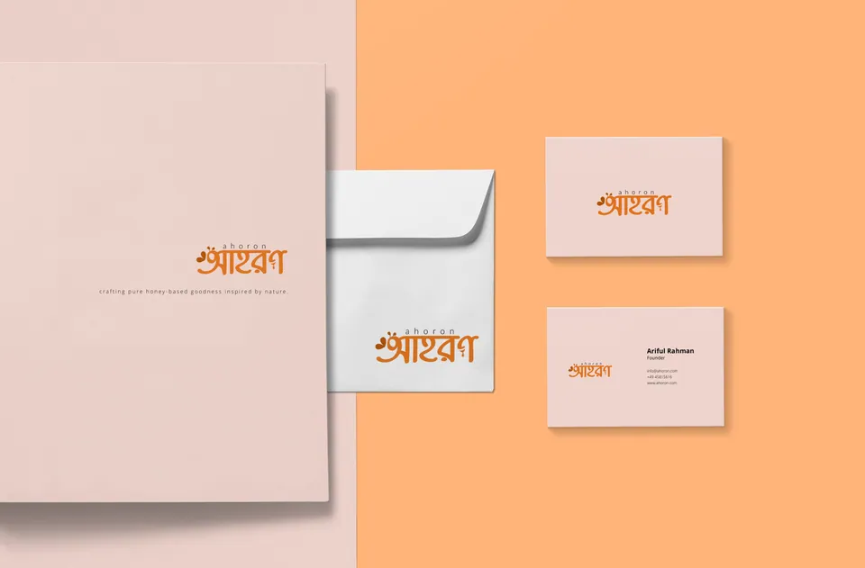
Ahoron makes premium honey-based products across food, wellness and personal care. It is inspired by nature and by Bengali cultural heritage, and it wants to be read well beyond Bangladesh.
- Mission
- To bring nature’s purity to every home through honey-based products that blend tradition, innovation and authenticity.
- Vision
- A global symbol of trust and quality in natural products, uniting heritage with modern innovation.
- Essence
- Pure, authentic, innovative.
Cell 02The trap
Natural brands all reach for the same honeycomb.
Generic comb vectors, brown paper, traditional lettering. It reads as homemade, and it caps how premium a jar can feel.
Ahoron needed to leave that look behind without leaving its culture behind. So the story went into the one thing no competitor abroad could copy: the language.
Modern heritage.
Before: rustic or premium
- Market position
- Ahoron offers premium honey-based products across food, wellness and personal care, for a global audience looking for purity and vitality.
- The bottleneck
- To compete internationally it had to leave the hyper-local, homemade look behind without losing its cultural soul. The identity needed to join Bengali heritage with modern, premium innovation.
- The positioning
- Not only a seller of honey, but a lifestyle brand that stands for diligence, trust and the golden richness of nature.
Cell 03The letter
A bee, the letter আ, and a heart.
The Bangla letter আ is the architecture. A bee is embedded in it: hard work, nature, the pure taste of honey. And in the curve, a heart.
Culture, category and care, in one glyph.
- Bee
- Bangla letter
- Love
আহরণ
Design decisions
- The gestalt brandmark
- The classic Bangla letter আ is the architecture. Into it we set the silhouette of a bee and the curve of a heart. One mark, three readings: cultural identity, category, and emotional connection.
- A golden-vitality palette
- No dull, rustic browns. A vibrant orange stands for trust, wellness and the richness of honey, grounded by charcoal and crisp white for a clean, modern edge.
- The international counterweight
- Lato Light sets the English name. Its clean, geometric forms balance the strongly cultural logomark and keep the brand legible to an international audience.
Cell 04Honey tones
Orange leads. Brown paper is retired.
Orange is the dominant colour: trust, energy and the richness of honey. Charcoal grounds it. White keeps it clean enough for a premium shelf.
Light primary
The dominant orange.
Dark primary
Deeper honey, for depth.
Dark support
Charcoal. Grounds the warmth.
White support
Crispness and space.
Tap a colour to copy it.
Cell 05Counterweight
A cultural mark, balanced by a quiet Latin line.
The English name is set in Lato Light, wide and calm, so the brand stays legible to an international shelf. And the symbol holds down to 64 pixels.
a h o r o n
The logo follows a minimal style, so it survives being small.
Cell 06The range
One jar became a whole shelf.
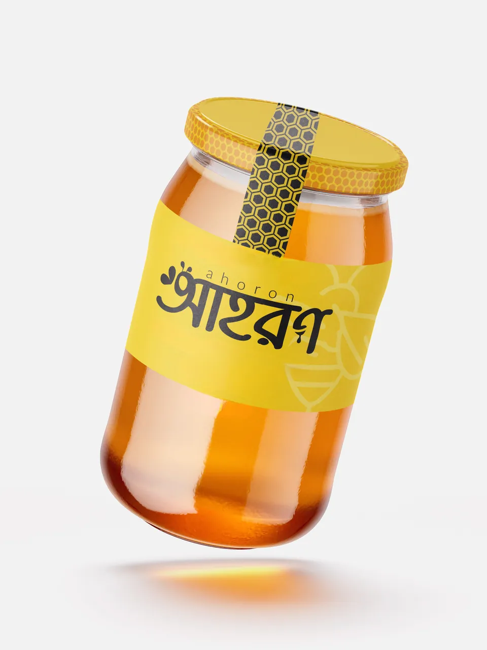
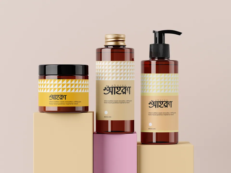
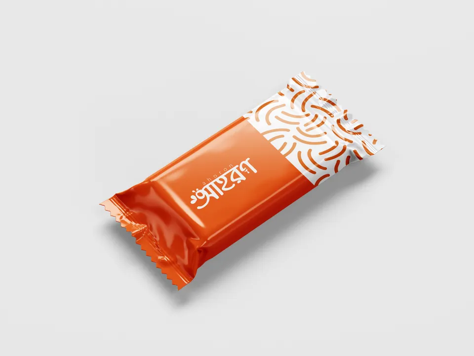
Honey, wax, shampoo and bars share one system, so Ahoron reads as a wellness lifestyle rather than a single product.
Strategy in application
- A product ecosystem
- One packaging system joins raw honey jars, wax, shampoos and energy bars, which shows Ahoron as a wellness lifestyle and not a single-product company.
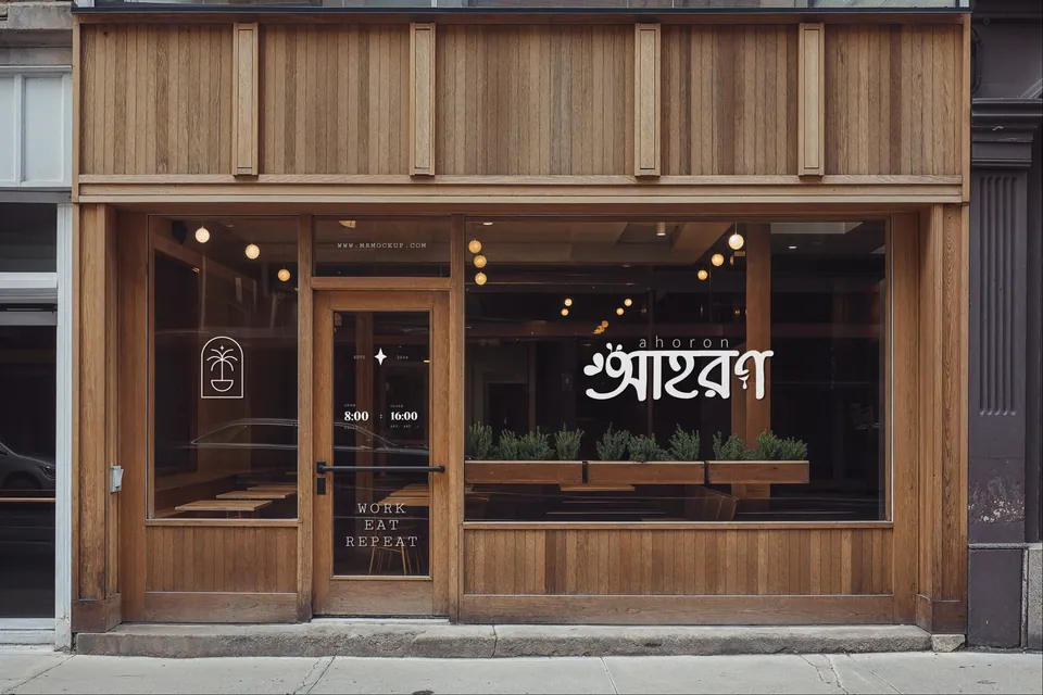
- The heritage shop
- A concept for a café and retail space in warm wood and clear glass shows how the brand translates into hospitality.
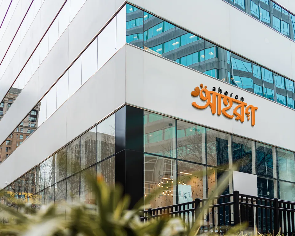
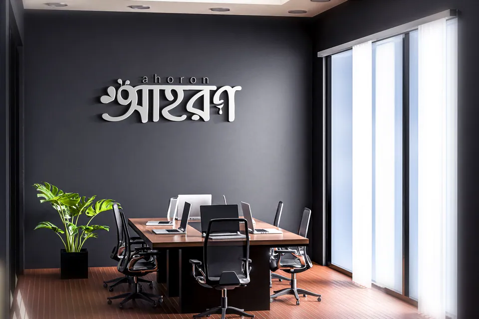
- Corporate authority
- Large brushed-metal signage on corporate buildings gives the brand enterprise-level stability alongside its natural roots.
Cell 07The shop
And then a place to walk into.
A heritage shop concept in warm wood and glass, and brushed-metal signage for the corporate side.
Cell 08The outcome
Culturally rooted, ready for a global shelf.
Ahoron now has an identity that does not trade cultural pride for commercial reach.
- Instant distinctiveness
- Using native typography as a modern design element separates Ahoron from Western-centred wellness brands straight away.
- Scalable architecture
- The minimal execution keeps the logo intact whether it is a 64-pixel favicon or an illuminated sign on a tower.
Pure, authentic, innovative.
Diligence, trust, and the golden richness of nature.